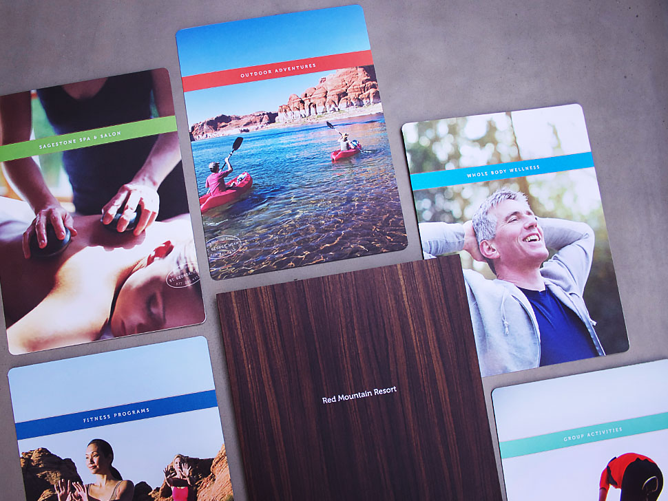
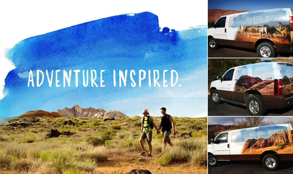
Red Mountain Resort is an adventure vacation resort. A place where you can clear your head and rejuvenate your soul. During a 4-day on location photoshoot, it quickly became apparent that Red Mountain needed a brand worthy of southern Utah's best kept secret.
The goal was to reposition the property from what was once known as a spa with a following that was mostly women ages 45-65, to an adventure vacation destination for men, women and couples ages 25-55. The design and tone of each item was carefully considered and the nature inspired resort emerged as endearing and adventurous with a touch of whimsy.
Printed pieces featuring close-up, organic textures provide a striking contrast to the grand scale outdoor photos. Many of the newly designed items literally spoke to guests with clean and elegant typography. The resort restaurant, cafe and outfitters store received their own brand refresh with logos, menus and color palettes that could all live under the Red Mountain umbrella.
Since the launch of the new look and re-energized personality, the resort has noticed an increase in male visitors as well as a marked decrease in the overall age of it's guests, a year-over-year increase in web visits and, most importantly, a steady increase in overall resort revenue.
My Role: Visual Positioning, Collateral Design, Creative Direction for Print and Digital, Photoshoot Direction, Brand Management, Naming
This project was created while working with the team at Fisher.


